
… without an H at the end!!
…as I am continually telling the students!
Danish designer Hanna Werning produces pieces which are like explosions of colour and pattern.

Werning’s beautiful, overlaid images appear on all manner of surfaces – wallpaper, greetings cards, notebooks, fabric…they are so diverse and varied.
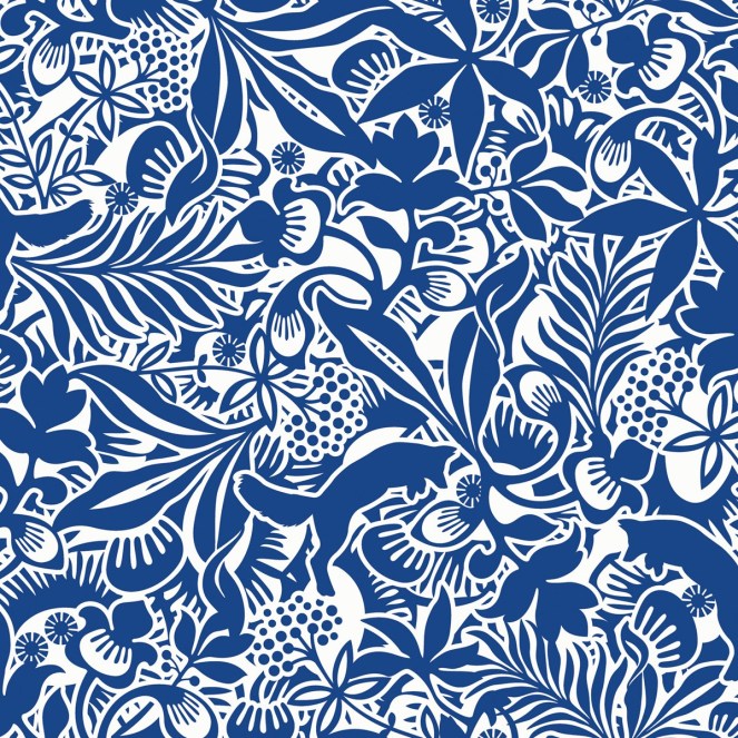
Usually a riot of different clashing colours, the image above shows that Werning’s designs work equally well in a monochrome colour palette.


The interesting thing about the work of Hanna Werning is, I think, the many different images that she chooses to place on her designs. It is not unusual to see a leaping fox in amongst seaweed, or tiny out of scale creatures surrounded by gigantic flora!


The two image above are among my favourite recent designs by Werning. I love how you can see each separate design, making it appear that some of the patterns are transparent.


Large scale or small scale, these designs really work. The clean cut, graphic quality they have keeps your eyes occupied and often you never know what you will find!


I love the images above – for me, they encapsulate everything that is good about this designer – her use of colour, her clever juxtaposition of different images, the variety of scale and clarity of line, all of which go to make her designs so successful and popular. She is somebody I regularly use as inspiration within my teaching.
